

The side panel: everything about a picture or video
What the panel on the right of your library shows when you click a picture or video: its buttons, stars, an ad's state, tags, folders and properties.
Click a picture or video in your library and the side panel on the right shows everything about it, with what you can do to it.
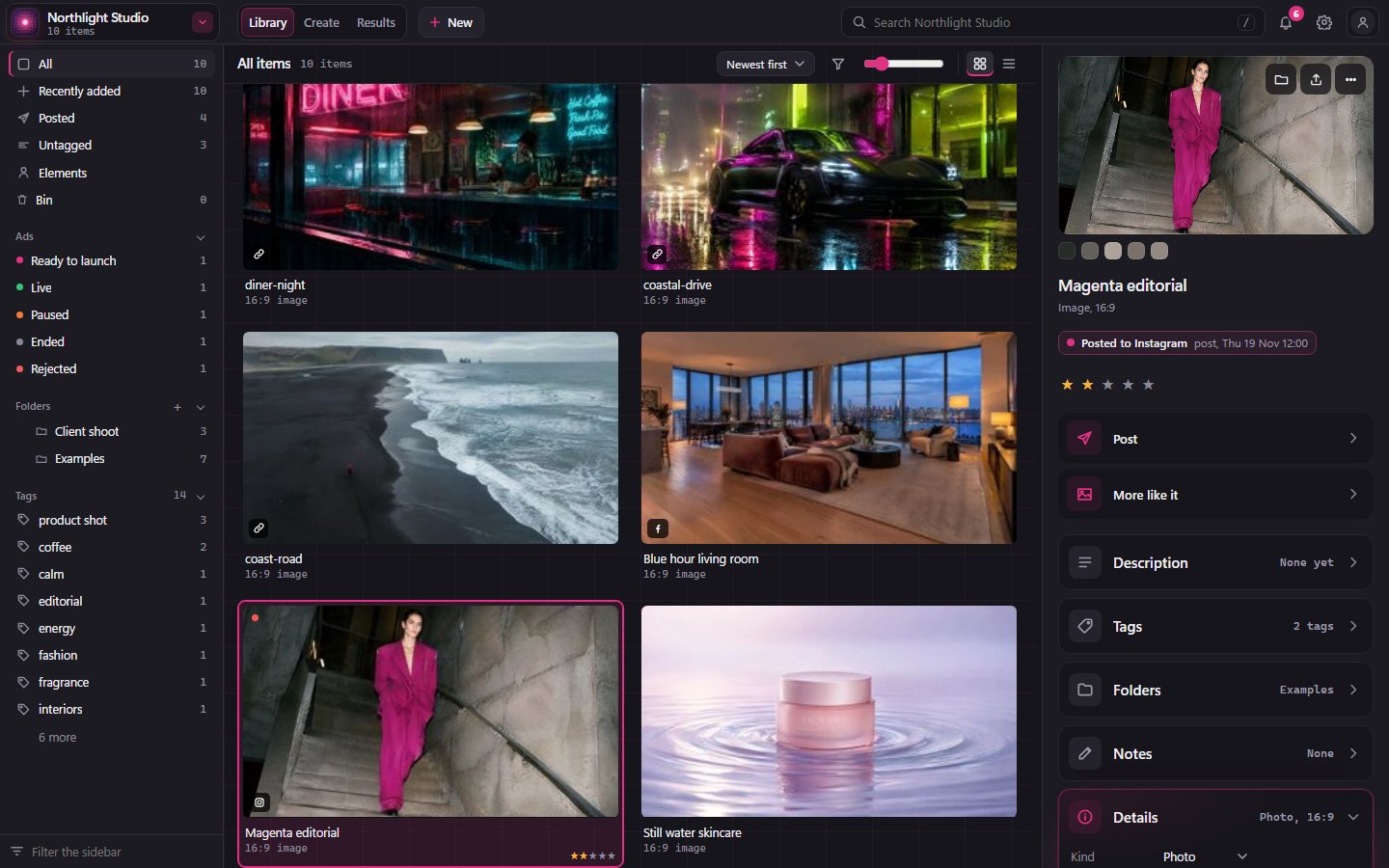
Over the picture
Three buttons sit over the top right of the picture:
- Show in folder opens the folder on your computer with the file selected.
- Export saves a copy where you choose.
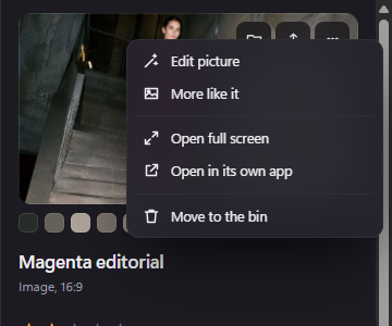
- More has the rest: Edit picture, More like it, Open full screen, Open in its own app and Move to the bin.
Once you've connected somewhere to post, such as YouTube, Post (the paper plane) is the first of them. It opens the Post window, where Write it with AI writes the post for you. See Posting to YouTube.
Under the picture are its main colours. Hold the pointer over one to see its colour code.
Stars and an ad's state
Click a star to give the item one to five stars. Click the same star again to take it off.
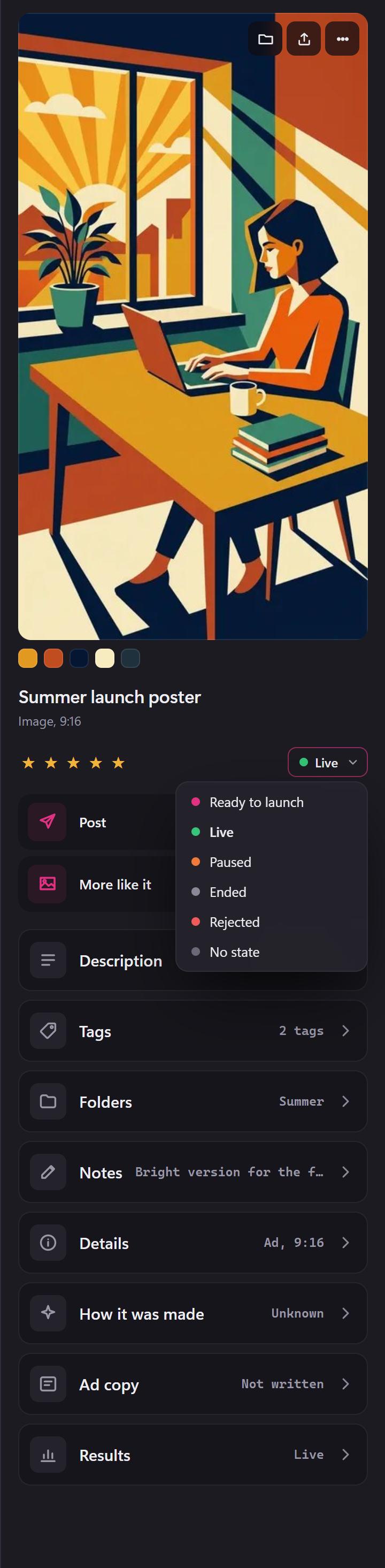
An item marked Ad also has its state beside the stars. From the next desktop build, choose Ready to launch, Live, Paused, Ended or Rejected there while it isn't on Meta. Ready to launch puts it in Ad Studio's Ready to launch. Once it's on Meta, Meta says what it's doing. Before that build, the review was Pending, Approved or Rejected, set there or with P, A or R.
Rows that open
From the next desktop build, everything is on one page. Under the stars come Post and More like it, then rows that open one at a time, each saying how it's set: Description, Tags, Folders, Notes, Details and How it was made. The row you open stays open as you go from item to item. Before that build, an ad had two tabs under its review, Details and Ad copy.
An ad also has Ad copy: its primary text, headline and description, with Write it, Check, Angle and Suggest to have the AI write and check them.

Results joins them once an item has results: how each of its posts did and, for an ad, how it does on Meta.
Description, tags, folders and notes
- Description: say what's in it, or click Describe with AI. Descriptions let you search by what's in a picture.
- Tags: type a tag and press Enter, or click Suggest tags with AI. The × takes a tag off.
- Folders: type a folder's name and press Enter to add the item to it. The × takes it out of that folder, never out of your library.
- Notes: anything you want to remember about it.
A social post also has Posted, for when and where it went out if you posted it yourself.
Details
Details lists the facts: its Kind (choose another from the list), its shape and size in pixels, the file's size, when it was added and its ID. File details shows more: the file's name, type, resolution, colour and dates, and Where it is. For a linked item, Copy into library is beside Where (see Adding your work). Fewer details hides them again.
Under it, How it was made says what made it, and More like it opens the canvas with this picture as the starting point for a new one.
The button at the foot
When an item waits on you, the foot of the panel has the one thing to do: Launch ad for an ad that's ready. From the next desktop build, there's no New and no Done: what arrives shows in All with a yellow dot on its tile until you open it, and Move to the bin is under More. Before that build, an item in New had Done and Delete at the foot.
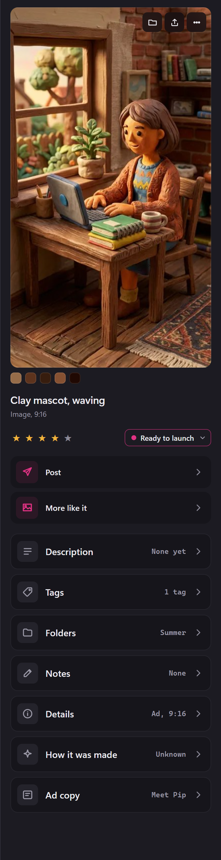
Nothing waiting, nothing at the foot.
Several at once
From the next desktop build, Ctrl-click or Shift-click several items and the panel works the same way for all of them: their pictures, how many are selected, the stars and, for ads, their state. Post, Group as sizes and Make a carousel are the rows to click, then Tags, Folders, Kind and AI, which change every one selected. The bar under your pictures says how many are selected, with Clear selection.